

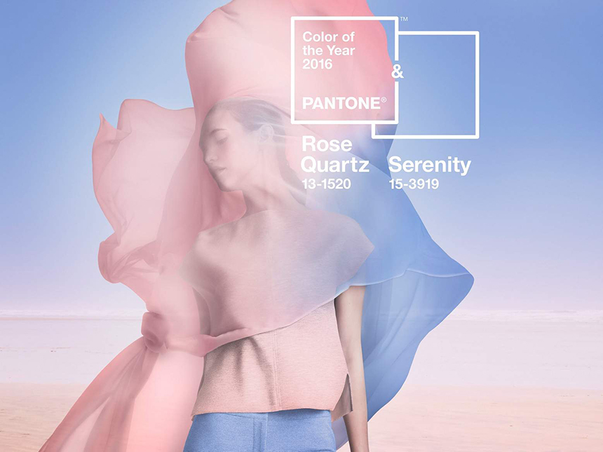
For the first time ever, Pantone announced TWO colors of the year! Dubbed Rose Quartz and Serenity, they are reminiscent of all things baby related, although Pantone says this was not the goal of this pastel pair. In addition to choosing two shades this year, the softer colors are also a departure from other year’s more daring picks. Take for example 2015’s Marsala, 2013’s Emerald or 2012’s Tangerine Tango.
So why two colors this year?
“Joined together Rose Quartz and Serenity demonstrate an inherent balance between a warmer embracing rose tone and the cooler tranquil blue, reflecting connection and wellness as well as a soothing sense of order and peace.” said Leatrice Eiseman, Pantone’s executive director in a statement.
“This more unilateral approach to color is coinciding with societal movements toward gender equality and fluidity, the consumer’s increased comfort with using color as a form of expression, a generation that has less concern about being typecast or judged and an open exchange of digital information that has opened our eyes to different approaches to color usage.”
Here are three ways you can start using this dynamic duo:
1. Jazz up your mobile device or desktop with these lovely shades by downloading this digital wallpaper from Pantone.
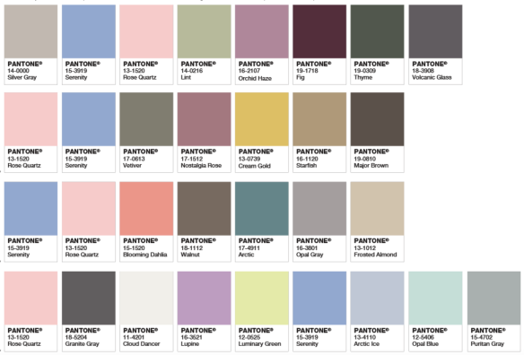
2. The Pantone website shares examples of how this pastel pair can integrate into a wide range of potential palettes.
Here are a few ideas:
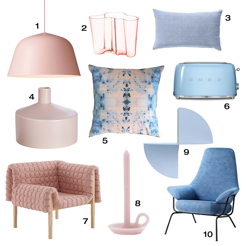
3. Freshen up your home or office space with these picks from Design Milk:
Learn more about how the Pantone Color (or colors!) of the Year are selected.