
For years mobile devices have been changing the way we view the web. According to Pew Research, nearly two-thirds of Americans now have a smart phone of some type, and use that as their main entry point to the internet.
Our web browsing habits (and our lifestyles) are more mobile than ever. We’re on the go at our jobs, with our friends, and family. Smartphones and tablets have enabled us to have that fast-paced lifestyle while staying connected and online.
As the leading search engine, Google is constantly tying to improve their ranking algorithm to mirror the way users are searching for content. Recognizing this mobile trend, in April of 2015 Google started penalizing a site’s ranking on mobile search results if the site was not mobile compatible and rewarding those that utilized a responsive design. Read more here.
A responsive website is no longer a nice feature to have for your business. It is a necessity!
In 2016 we’re making responsive websites a standard practice for all web design projects. When people find your company online, there is a good chance they will be using a mobile device so your website needs to be optimized for fast, easy viewing no matter where they are viewing your site.
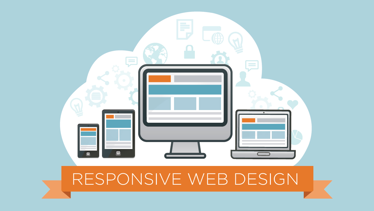
So what exactly is responsive website design?
In layman terms, a responsive website design provides an optimal viewing experience, including easy reading and navigation with very little resizing or panning across a wide range of devices (desktop, laptop, tablets or mobile phones).
Responsive web design is not to be confused with fluid web design. Check out the illustration below to understand the difference.
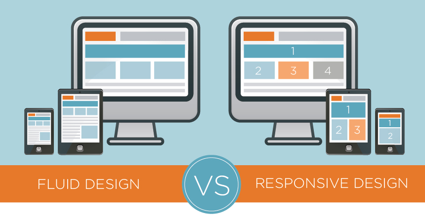
In a non-responsive design the website looks the same on the desktop as on the mobile device. In essence, the site just scales to the width of the device. On a mobile device or tablet, that can make the navigation and body copy very small, hard to read and cumbersome.
With the responsive design you can see how the navigation and layout changes to adjust to the viewing device. The body text is large on the mobile device and the navigation is optimized for the tablet and smartphone. The user does not need to immediately zoom in or resize the content in order to view or read it. Plus, the navigation menu changes to make it easy for the user to browse the site via a small touch screen.
Wondering if your website is mobile-friendly? Click here to use Google’s free tool to check.
If you’d like to talk to us about a responsive website design and what we can do for you, we’d love to chat! Give us a ring at 910.681.0548 or send us an email.