
A before/after pair communicates retouching skill faster than any description. The technique is simple but three details decide whether it looks professional or amateur: alignment, labels and a divider that does not obscure the seam.
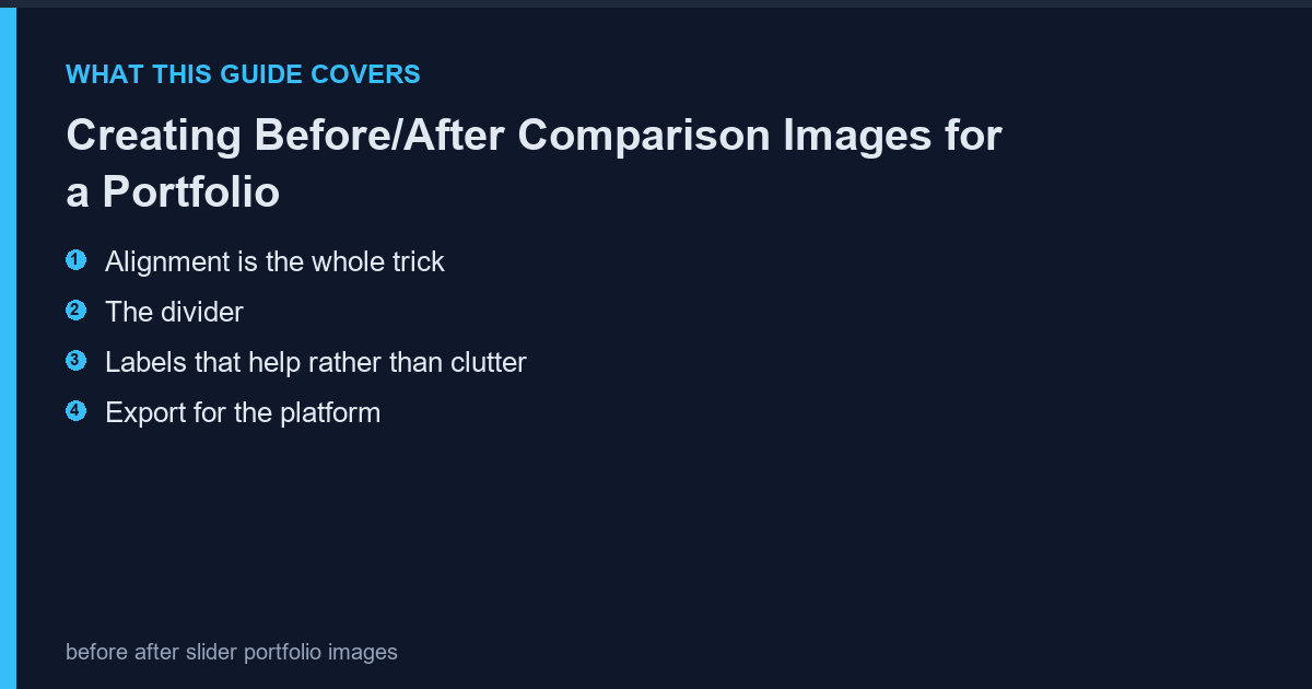
Alignment is the whole trick
Crop both versions to identical dimensions and identical content. A half-pixel shift makes the comparison feel wrong even if nobody can articulate why. Crop once, duplicate, then apply the edit to one copy.
The divider
A one-pixel white line at 100 percent zoom is enough. Anything thicker steals attention from the work. For a diagonal split, keep the angle identical across every image in the portfolio so the set looks like a series.
Labels that help rather than clutter
Small text in a corner, one word each, same typeface, same size, same position. Do not add arrows or circles; they imply the viewer cannot see the difference. The photoscape-free.com covers the combine tools that place two crops side by side with exact spacing.
Export for the platform
Portfolio sites and Instagram both recompress. Export at 2048 px on the long edge with quality 90 and check the seam after upload. A 1-pixel divider often disappears after recompression, so verify on the live page, not locally.
Frequently Asked Questions
Should the before be on the left?
Yes in most Western markets. Left-to-right reading makes before-then-after the intuitive order.
Is a slider better than a static split?
A slider is more engaging but requires JavaScript. A static split works everywhere and is what most portfolios use.
Can I use the same split for video?
Yes, with the same alignment rules. Video compression punishes thin dividers even more, so use two pixels there.