Logo redesigns can make a strong and subtle impact. Logos are a critical component of a company’s identity. They are a simple graphic representation of your brand that leaves the first impression for your customer or client. To keep a brand current, many companies will implement a brand refresh, which usually includes a logo redesign. Let’s take a look at a few logo redesigns from 2017.
Chobani

Chobani has been a staple greek yogurt brand on grocery store shelves since 2005. Founded by Hami Ulukaya, a Turkish immigrant who “bought an old yogurt plant, and brought a small group of passionate individuals together to make the real, wholesome yogurt that he remembered from his childhood.” He named the company Chobani, which means “shepherd” in Turkish reflecting his compassionate, hard-working spirit.
This brand refresh has definitely shifted toward a more natural, wholesome look that better reflects the roots of this company. The old logo was clean and modern, with a Greek feeling typeface. The bold black and white packaging with bright colors was fresh, but gave it a cold feel.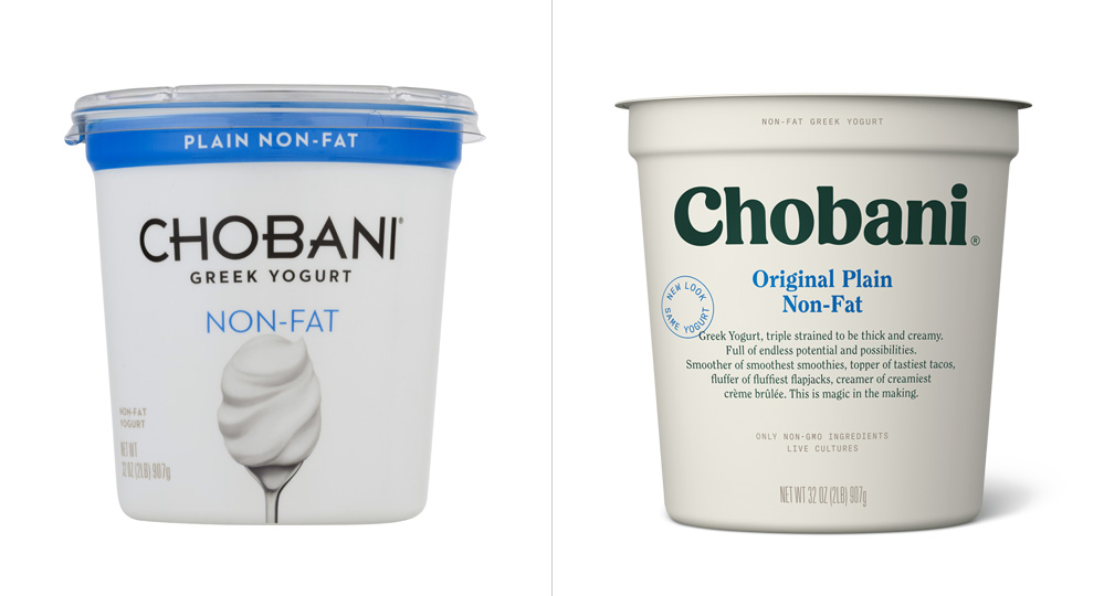
The new look incorporates a deep green color evoking a natural and healthy feeling. Paired with the new off-white packaging and a softer, more Turkish looking typeface, the look feels more organic and approachable yet still slightly modern. I don’t think the old logo was bad, but I really love the overall shift in feel for this brand.
YouTube
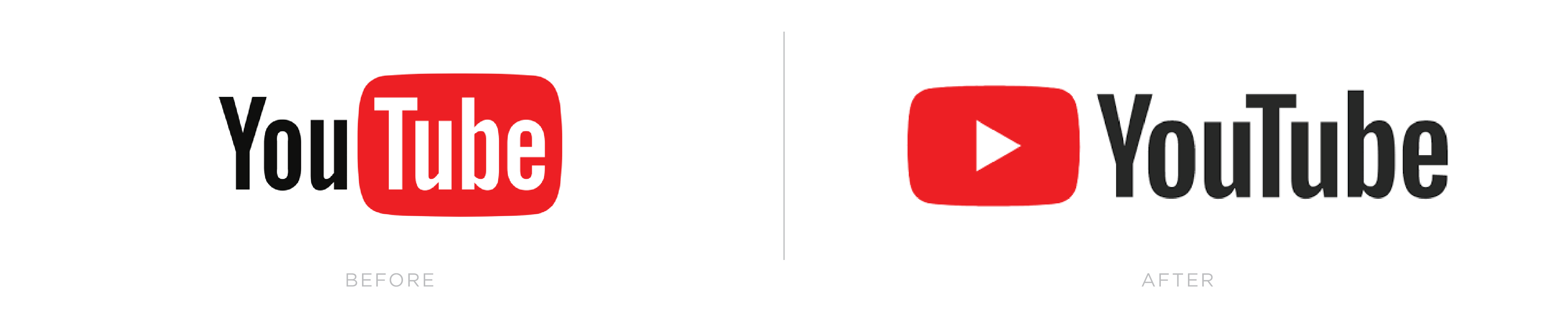
If you’ve ever watched a video online, chances are, it was on YouTube. YouTube is now one of the most popular sites online, with visitors watching around 6 billion hours of videos every month.
With this popularity comes brand recognition, and it’s important that a brand maintains that recognition with each logo revision. YouTube has given its logo a very slight refresh after 12 years. This change is subtle, yet strong. They have shifted the red shape from around the word “tube” and are now using it as a graphic icon symbolizing a play button. Another subtle, but impactful change was brightening up the brand’s red color. “Designed for our multi-screen world, the updated logo combines a cleaned up version of the YouTube wordmark and Icon, creating a more flexible design that works better across a variety of devices and even the tiniest screens. Why is it more flexible? When room is limited (say on a smartphone) you can use the brightened up icon as an abbreviated logo, which will be seen more easily and read more clearly.” (https://youtube.googleblog.com/2017/08/a-new-youtube-look-that-works-for-you.html) Overall, the YouTube logo redesign was subtle but successful. Sometimes less is more and little changes can easily refresh your brand.
Redbox
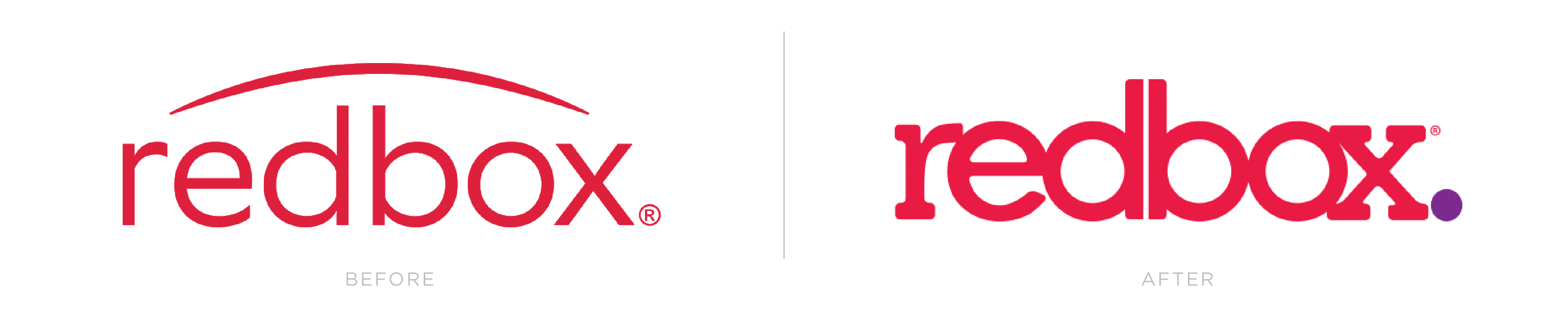
Redbox might soon be a thing of the past. They are now competing with online streaming services such as Netflix, Amazon, and Hulu and need a strong brand to maintain its prevalence in the movie world. Unfortunately, this logo rebrand missed the mark.
First of all, they’ve updated the font to an awful slab serif. There are good slab serif font options out there, but this particular one is a terrible choice with messy slabs and uneven lettering. The kerning is so tight, it almost becomes unreadable. Commenters on the brands Facebook page are calling it “realbox” and “redbax” because of the poor kerning. Another problem with the serif switch, is that I can’t seem to get the “Redbook” magazine logo out of my mind.
If the disastrous typeface selection wasn’t enough, they tacked on a clunky purple period at the end. This distracting mark provides no significant meaning or context.
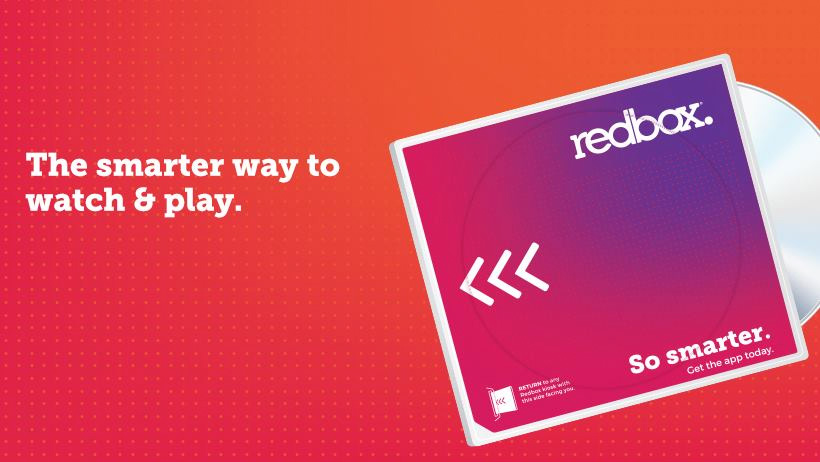 Finally, Redbox made yet another poor rebranding decision and updated their tagline to, “So smarter,” which makes them appear anything but.
I have nothing against Redbox, but can’t help but cringe after this train wreck of a re-brand. They could have been so smarter.
Let us help you make a smart decision about your rebrand. Give us a call at 910.681.054 or send us an email to find out how we can help.