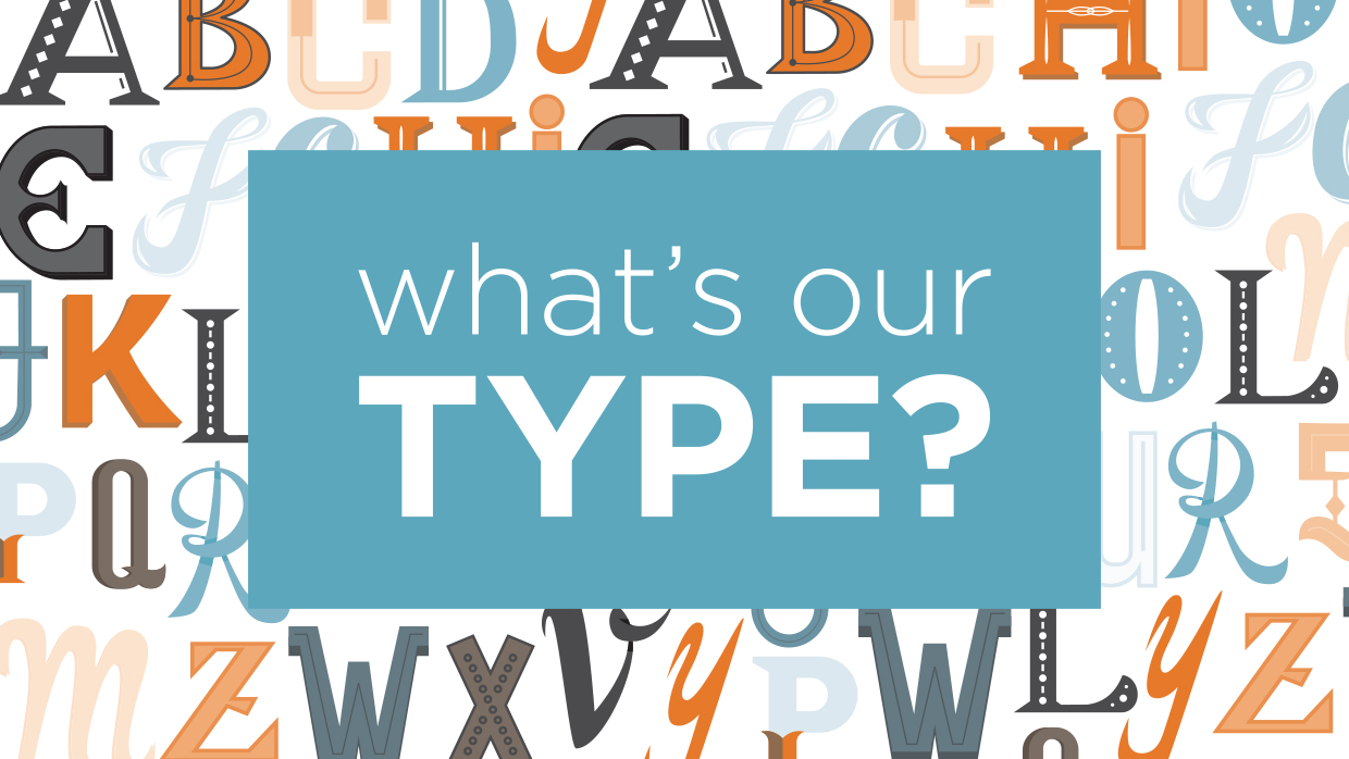
Just as taste and style can be reflected in the clothes you wear, music you listen to and foods you enjoy, it can also play a role in the fonts you’re drawn to. As designers, we are constantly making decisions about fonts — what style is best for a particular client, the spacing in and around the letters, the color, the most effective placement in a layout… So there is no doubt as to why we’ve developed a few crushes along the way! Below are our team’s personal font crushes.
Emily’s Current Crushes:
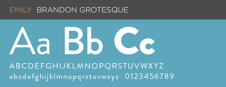
Grotesque means comically or repulsively ugly or distorted, and this font is just the opposite. Perfectly simple, clean, and rounded. I’m a sucker for geometric sans-serifs and Brandon Grotesque always wins my heart.
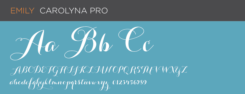
I’ve never had great penmanship. Thanks to the growing popularity of handwritten script fonts, I can bask in beautiful scrolls, swirls and curls without ever having to touch a pen. It’s not fair to choose just one as my favorite, the styles and variations that are available now are endless.
Alex’s Crush:
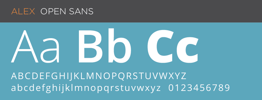
Call me boring, but as a programmer/developer, I like to keep it clean and simple. Google’s Open Sans typeface does an excellent job of that. Arial and Helvetica used to be the go-to, but they weren’t really designed for reading on the internet, they were merely adopted because there weren’t any better options. Open Sans was made with the internet in mind, and it’s one of the best fonts for reading paragraph text on the web. Many companies have made the switch from the latter day fonts, including two of my favorites; Foundation, and WordPress, and Open Sans has now become one of the most widely used fonts on the web. Another key aspect for me is that it’s provided as open-source. Free and beautiful, just like the internet should be!
Lindsay’s Current Crushes:
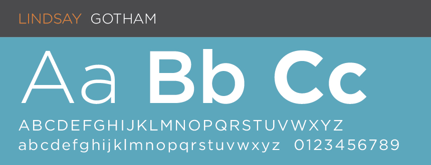
Gotham is my main squeeze. It’s sleek, classic and always looks polished. It also works well both in print and online. True fact: this font was developed specifically for GQ magazine!
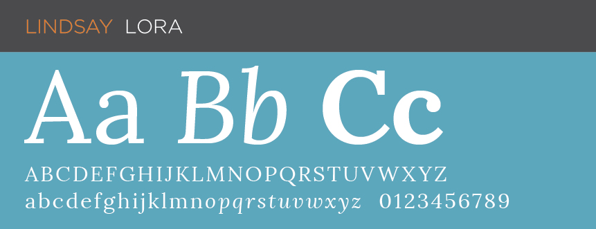
Lora is one of the few serif fonts that includes a nice looking italic style that works well as an accent treatment in layouts. The Lora font family also pairs nicely with my favorite sans serif font, Gotham. Plus, it’s optimized for screen appearance, and works equally well in print, making Lora a great font to use for brand consistency across all media.
Lauren’s Current Crushes:
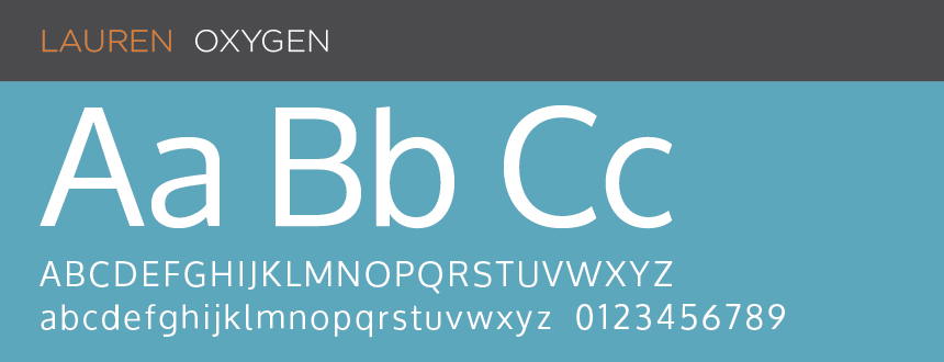
My go to font is Oxygen. I love this font because it’s clean and has great readability. The various font style options (light, bold, etc.) help make it even more versatile. It is part of the Google font family, so it’s one that is compatible with desktop applications and can be used on websites. It’s a great font for body copy, and a nice alternative to Arial (a long time go-to before Google fonts came out).
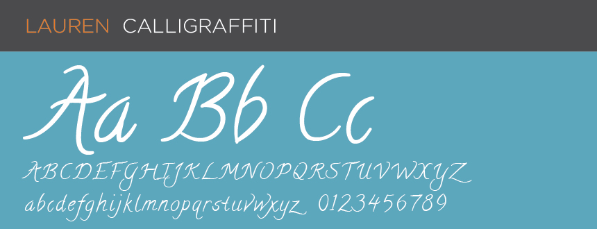
I recently came across this font and think it is a fun script font that gives character and style. While it’s not right for all businesses or brands, it’s works well as a display font, used in short bursts at large point sizes in headlines or titles. It’s also part of the Google font family so as a web specialist, I always love a fun font that’s web compatible.
We’d love to hear what your type is! Drop us a line at 910.681.0548 or send us an email.