You’ve probably heard about color psychology, and how different colors can convey and elicit certain emotions. When working with color palettes in design, these same principles should be kept in mind.
According to color psychology research, red is associated with excitement, passion, and hunger. That’s why many fast-food restaurants use the color red in their branding. Blue can communicate tranquility or stability and is often used in branding for businesses that want to portray trust. Green brings thoughts of health and prosperity. Think about all the grocery stores with green in their logo – Publix, Whole Foods, and Lowes Foods, to name a few.
The colors in the examples above are the brands’ dominant colors. But most companies also use supporting colors to create a complete brand palette. During our design process, we consider the meaning of each color, but also how colors work with each other.
Here are three types of color palettes and why we like them:
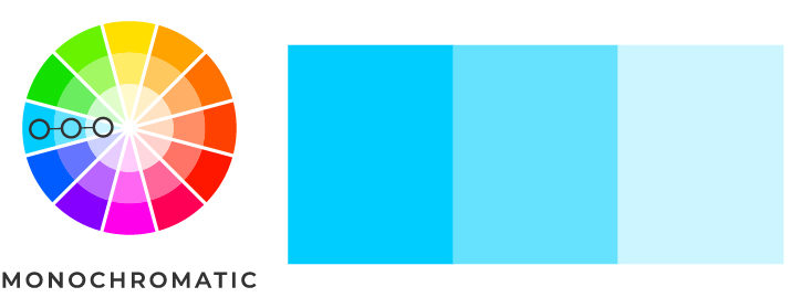
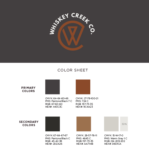
A monochromatic color palette uses shades and tones of a single color. Together, they create a soothing palate that conveys elegance and harmony.
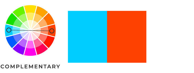
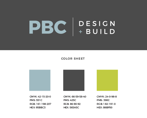
This color palette uses complementary colors to create drama and can feel vibrant and exciting. This palette works best when using both warm and cool colors for a high level of contrast.
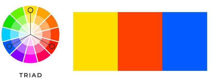
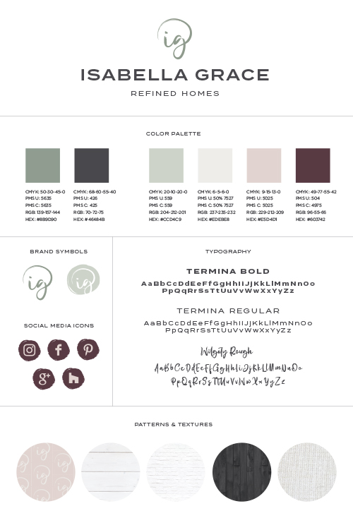
A triad color palette includes colors that are equal distance from each other on the color wheel. A triad palette can be tough to balance, but the right selection of colors can add excitement to your brand.
As designers, we choose and work with color palettes every day. A well-balanced and carefully curated color palette can help communicate a brand’s values and uniqueness. Below are some real-life examples of color palettes we’ve created for our clients:

Want us to choose a great color palette for you? Send us an email or give us a call today.